Accessibility for the Web
Posted on December 3, 2018 in Accessibility by Matt Jennings
Accessibility Definition
Accessibility is the design of products, devices, services, or environments for people with disabilities (cited from Wikipedia on December 21, 2018).
What this Looks Like for the Web
Designing websites with accessibility in mind means making websites easy for people to use with various disabilities, like blindness, deafness, and physical disabilities. Some examples of this are:
- Adding HTML that makes it easy for people to navigate using their keyboards with a screen reader.
- Adding high enough contrast in colors so that fonts and logos are legible on background colors.
Why Accessibility
- So people with disabilities can surf the web, sometimes using screen readers.
- Many elderly people suffer visual impairments, or other disabilities, as they age.
- Companies have been sued for not providing accessible websites (like Nike and others).
How to Make HTML Accessible
- Use WAI-ARIA code. WAI-ARIA stands for: Web Accessibility Initiative – Accessible Rich Internet Applications
- WAI-ARIA are HTML recommendations published by the World Wide Web Consortium (W3C).
- For short I’ll refer to WAI-ARIA as ARIA.
- ARIA HTML allows screen readers to read web pages.
Accessible Links
-
Use an aria-label attribute in an a tag for accessible links, such as the example below from the https://www.mattjennings.net/ home page:
<a href="contact" aria-label="Let's build a website together and see my contact page!">Let’s build a website together!</a>
- Screen readers read the above link as: Let’s build a website together and see my contact page!
- Simple links such as “Read more” should always have an aria-label attribute to be accessible and provide context to screen reader users.
- Below is an example:
<a href="contact" aria-label="Read more and see my resume">Read more</a>
- The word aria is found all the time in ARIA HTML.
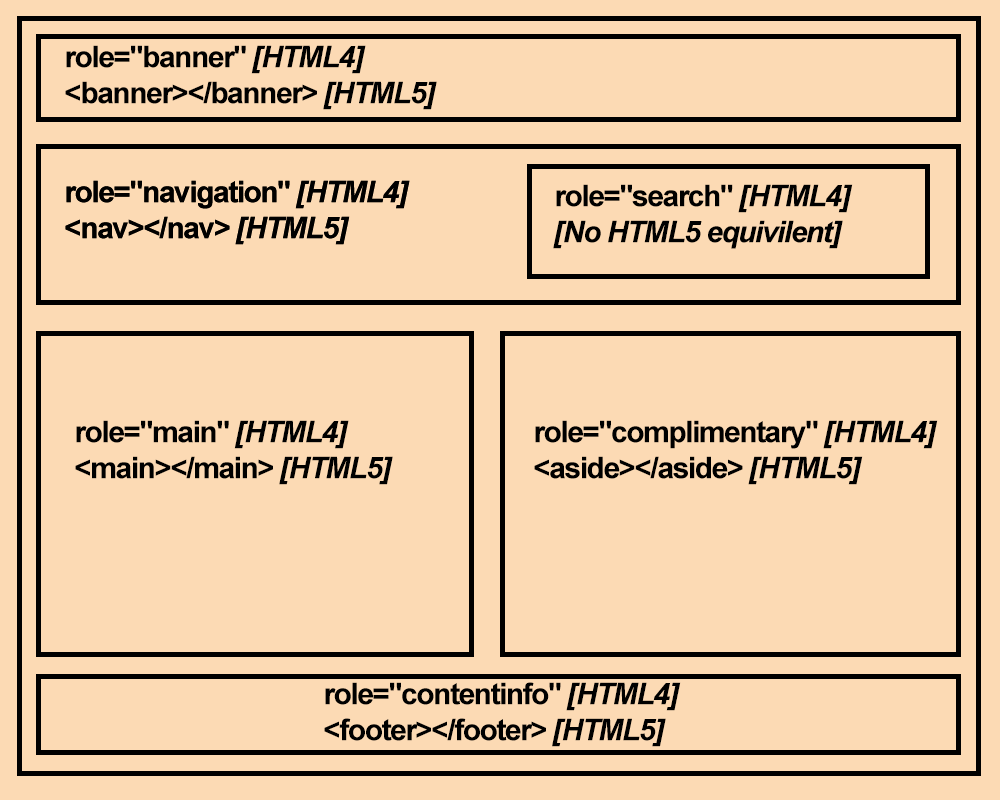
ARIA Landmarks
Landmarks are ARIA HTML that show screen reader users where they are on a page. The graphic below shows an example of additional landmarks.
This page from the W3C has more information about ARIA landmark roles.
Banner Landmark
The banner landmark wraps the website logo and LinkedIn and GitHub links on https://www.mattjennings.net/:
<!-- HTML5 code -->
<header></header>

<!-- ARIA role only -->
<div role="banner">
    <!-- LinkedIn and GitHub links here -->
    <!-- Website logo here -->
</div>
Navigation Landmark
As you can see below, by using adding code like below with the role attribute you can add navigation.
<!-- HTML5 code -->
<nav>
    <!-- Menu items here -->
</nav>

<!-- ARIA role only -->
<div role="navigation">
    <!-- Menu items here -->
</div>
Main Landmark
The main landmark wraps text in the main content area at https://www.mattjennings.net/:
<!-- HTML5 code -->
<main>
    <!-- Main content here -->
</main>

<!-- ARIA role only -->
<div role="main">
    <!-- Main content here -->
</div>
Footer Landmark
The footer landmark wraps content in the footer area at https://www.mattjennings.net/:
<!-- HTML5 code -->
<footer>
    <!-- Footer text here -->
</footer>

<!-- ARIA role only -->
<div role="contentinfo">
    <!-- Footer text here -->
</div>
ARIA Live Regions
Using JavaScript, it is possible to dynamically change parts of a page without requiring the entire page to reload — for instance, to update a list of search results on the fly, or to display a discreet alert or notification which does not require user interaction. While these changes are usually visually apparent to users who can see the page, they may not be obvious to users of assistive technologies. ARIA live regions fill this gap and provide a way to programmatically expose dynamic content changes in a way that can be announced by assistive technologies.
Read more on ARIA live regions.
JavaScript using ARIA Live Regions
When JavaScript manipulates the DOM, ARIA live regions should be added to interact with screen readers.
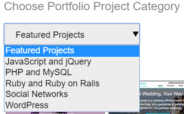
An example is on https://www.mattjennings.net/ when using the “Choose Portfolio Project Category” drop-down (“Featured Projects”, “JavaScript and jQuery”, etc.):
On https://www.mattjennings.net/, the code below exists:
<div id="portfolio-update-text" class="show-screenreader-only" role="alert" aria-live="polite"></div>
- role=”alert” means that when JavaScript inserts content into the div element, that content wil be read out by a screen reader.
- aria-live=”polite” means that a screen reader will read out content in the div element only after the current screen reader action is completed (such as when a screen reader user stops typing).
-
On https://www.mattjennings.net/, when “WordPress” is selected from the select tag drop-down JavaScript inserts Page updated to show WordPress portfolio items text into the div element:
<div id="portfolio-update-text" class="show-screenreader-only" role="alert" aria-live="polite"> Page updated to show WordPress portfolio items </div> - The VoiceOver screen reader on a Safari browser on a Mac computer will say: Page updated to show WordPress portfolio items
- The Golden Rule when using ARIA HTML and JavaScript: Whenever the DOM is changed using JavaScript, use ARIA HTML and JavaScript to have screen readers say a change was made, if a screen reader user needs to know about it.
Color Contrast
It’s highly recommended that text has a contrast ratio of at least 4.5:1 with the background. Contrast ratio is an algorithmic method of color contrast. See the short video below for more details:
Color Contrast Page Example
As you can see on https://www.mattjennings.net/, the large headings have a dark gray color (hex is #616161) on a white background (hex is #fff) for a contrast ratio of 6.2:1 which is greater than 4.5:1.
Color Contrast in Focus Outlines
It’s also recommended to include color contrasts of at left 4.5:1 in focus outlines. You can see focus outlines by clicking on the background of a web page and using the Tab button on your keyboard (or Shift + Tab buttons on your keyboard to go backwards).
Focus outlines appear around links and other interactive elements. Below is an example of a white focus outline around a text link that says Portfolio:
![]()
The focus outlines above are a color of white (#FFFFFF) on a background of dark blue (#1D4B5E) which has a color contrast ratio of 9.46:1.
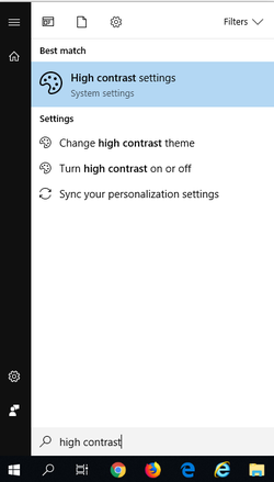
High Contrast Mode using Windows 10
Many people with visual disabilities using Windows 10 enable High contrast mode to more easily view websites. To enable high contrast mode in Windows 10:
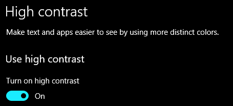
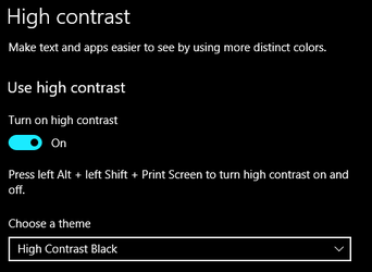
- Click on the Windows icon in the lower-left and then type high contrast. Now click on the High contrast settings settings option that appears:

- Now on the High contrast settings option, under the Turn on high contrast setting turn it On:

- Under the Choose a theme drop-down you can select High contrast Black or High contrast White.

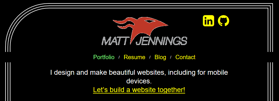
- Now open on the Edge browser, and go to a website. The example below is a screenshot of what https://www.mattjennings.net/ looks like in High contrast Black mode:

Testing Color Contrast
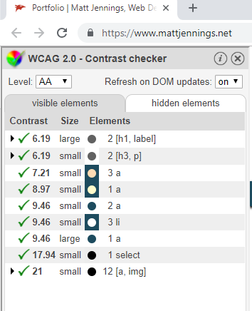
- Open the Google Chrome browser and add the WCAG Contrast checker plugin. Make sure this plugin is enabled in Google Chrome.
- Go to a web page you want to test (like https://www.mattjennings.net/) and click on the WCAG Contrast checker plugin Google Chrome icon:
- Then the WCAG 2.0 Contrast checker panel will open on the left-side, with color contrast values for various elements.

Testing for the Level: AA standard is OK, while testing for the Level: AAA standard various a higher level of color contrast for a higher level of accessibility.

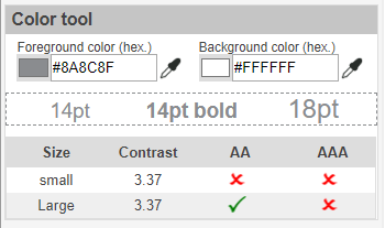
- Use the Color tool at the bottom of the WCAG 2.0 Contrast checker plugin panel to test if specific pairs of colors have a contrast ratio of 4.51:1.
As you can see the color pair below (#8A8C8F and #FFFFFF) does NOT have a color contrast ratio of 4.51:1.

Testing Web Accessibility
Google Lighthouse
You can use Google Lighthouse, which is build into the Google Chrome browser, to test for accessibility. See the video below for how to use.
Screen Readers
It’s highly recommended to test a website’s accessibility using a screen reader. It’s also suggested to learn one screen reader well enough to test. The recommended screen readers to test websites with are:
- VoiceOver (installed by default on newer Apple devices including Macs, iPhones, and iPads and works with Safari).
- Narrator (installed by default on Windows 10 devices and works with Edge browser).
- Talkback (installed on some Android devices)
- JAWS (Windows only, works with Edge browser, and free version available).
- NVDA (Windows only, works with Firefox browser, and software is free).
VoiceOver Screen Reader Tutorial
Narrator Screen Reader Tutorial
See the Narrator heading in the Basic screen reader commands for accessibility testing page.